Corporate
Opening Time

The Story Behind Our Logo
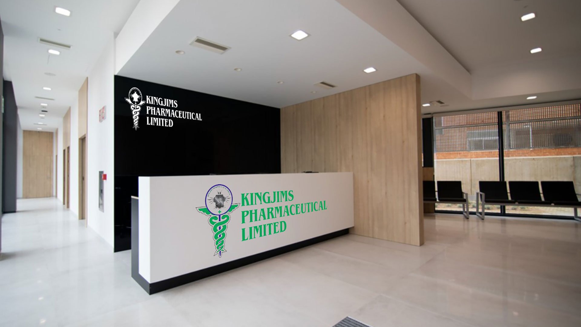
At KingJims Pharma, our logo is more than just a visual representation – it encapsulates the essence of our commitment to healing and well-being. The prominent feature of our logo is the Caduceus, an ancient symbol associated with the healing arts and medicine. It consists of a winged staff with two entwined serpents and is a powerful emblem that dates back to ancient Greek and Roman mythology.
The choice of the Caduceus in our logo is intentional, representing our dedication to health, vitality, and the intricate balance required in the field of healthcare. The intertwining serpents signify the dualities inherent in the healing process – the delicate balance between treatment and prevention, science and compassion, and the mind and body connection. The wings on the staff symbolize the elevation of health standards and the pursuit of excellence in medical care.
The color green, meticulously chosen for our logo, holds profound significance. Green is universally associated with health, growth, and harmony. It reflects our commitment to sustainable healthcare practices, environmental consciousness, and the continuous growth and evolution of our organization. The verdant hue is a visual testament to our pledge to contribute to a healthier, more balanced world.
As we look at our logo, we are reminded of the responsibility we bear in advancing healthcare and the trust our stakeholders place in us. It serves as a constant reminder of our mission to provide innovative, patient-centric solutions while maintaining the delicate equilibrium necessary for the well-being of individuals and communities. We invite you to delve deeper into the symbolism of our logo, understanding the narrative it weaves about our values, aspirations, and the healing journey we embark on every day at KingJims Pharma.


